
How to Choose the Perfect Colour Palette for Every Room in Your Home
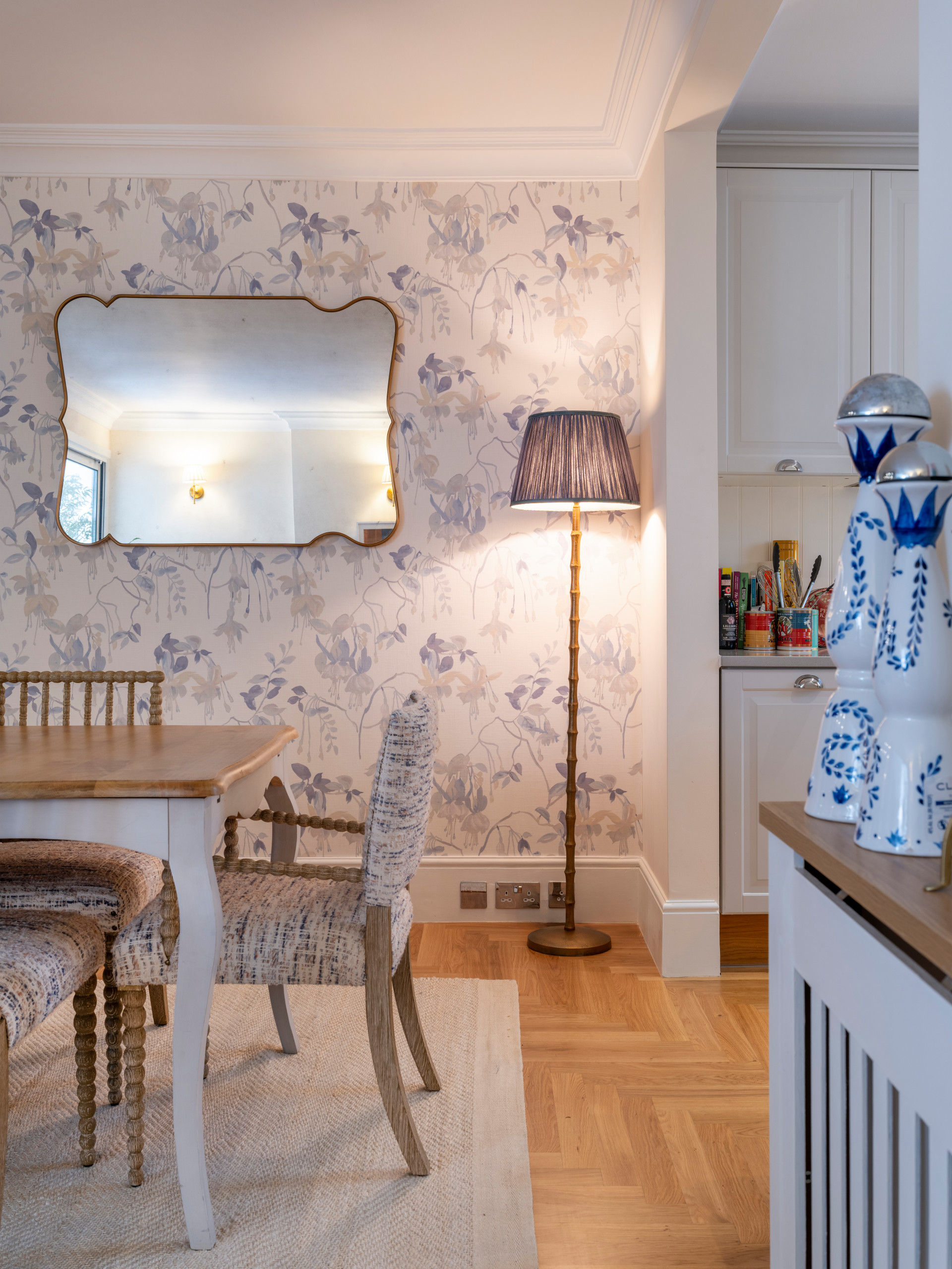
Choosing a colour palette for your home is one of the most exciting parts of any interior design project. The right colours can completely transform a space, making it feel brighter, larger, warmer or more relaxing. They also play an important role in creating a home that feels cohesive and reflects your personal style.
Whether you're renovating a single room or redesigning your entire property, selecting the right colour palette is key to achieving a timeless interior. Here's our guide to choosing colours that work beautifully in every room of your home.
Why Colour Matters in Interior Design
Colour is much more than decoration—it influences how a room looks, feels and functions.
A carefully chosen colour palette can:
Create a welcoming atmosphere
Make smaller rooms feel more spacious
Add warmth and personality
Enhance natural light
Connect different areas of your home
The best interiors don't rely on dozens of colours. Instead, they use a carefully considered palette that creates balance and harmony throughout the property.
Understanding Warm vs Cool Tones
Before selecting paint colours, it's important to understand the difference between warm and cool tones.
Warm Colours
Warm tones create a cosy and inviting feel.
Examples include:
Soft beige
Warm white
Terracotta
Sand
Taupe
Rich browns
These colours work particularly well in living spaces, dining rooms and kitchens where you want to create a welcoming environment.
Cool Colours
Cool tones create a calm, fresh and relaxing atmosphere.
Popular choices include:
Sage green
Soft blue
Cool grey
Pale green
Misty neutrals
These colours are often used in bedrooms and bathrooms where tranquillity is the priority.
Choosing Colours Based on Room Size
The size of your room should influence your colour choices.
Small Rooms
Lighter shades help reflect natural light and create the illusion of more space.
Consider:
Warm white
Soft cream
Pale beige
Light greige
Adding mirrors and layered lighting alongside lighter colours can further enhance the feeling of openness.
Large Rooms
Larger spaces offer more flexibility.
Deeper shades such as olive green, navy or chocolate brown can create intimacy without making the room feel enclosed.
Colour Ideas for Living Rooms
The living room is often the heart of the home, making it the perfect place to create a welcoming and sophisticated atmosphere.
Timeless colour combinations include:
Warm white and oak
Beige with olive green accents
Soft taupe and black detailing
Greige with natural stone textures
Layering different textures through fabrics, rugs and furniture adds depth while keeping the palette refined.
Best Colours for Kitchens
Modern kitchens are moving away from stark white designs in favour of warmer, more natural tones.
Popular kitchen colours include:
Sage green cabinetry
Mushroom and taupe
Soft cream
Deep navy islands
Natural timber finishes
Pairing these colours with quartz or stone worktops creates a timeless kitchen that won't quickly date.
Bedroom Colour Trends
Your bedroom should feel calm and restful.
Soft, muted tones help create a peaceful retreat.
Trending bedroom colours include:
Warm beige
Dusty rose
Olive green
Soft blue-grey
Earthy neutrals
Layering cushions, throws and upholstered furniture in complementary tones adds warmth without overwhelming the space.
Bathroom Colour Inspiration
Bathrooms are increasingly being designed as spa-inspired spaces.
Popular colour palettes include:
Stone and sand
Soft grey with timber
Warm white and brushed brass
Travertine-inspired tones
Sage green with natural textures
Natural materials and subtle colour combinations create a luxurious, relaxing atmosphere.
How to Create Flow Throughout Your Home
One of the biggest mistakes homeowners make is treating every room as a completely separate design project.
Instead, your home should feel connected.
You can achieve this by:
Using a consistent base palette throughout the property
Repeating accent colours in different rooms
Choosing complementary flooring
Maintaining similar finishes and materials
This creates a seamless transition from one space to another and gives your home a professionally designed feel.
Common Colour Mistakes to Avoid
Even beautiful colours can feel out of place if they're not used correctly.
Some of the most common mistakes include:
Choosing paint before selecting furniture
Ignoring natural lighting
Using too many bold colours
Following short-term trends
Forgetting to test paint samples at different times of the day
Taking time to plan your colour scheme will help you avoid costly decorating mistakes.
Why an Interior Designer Can Help
Choosing a colour palette for your home may seem straightforward, but achieving a balanced, cohesive interior requires careful planning and experience.
An interior designer considers:
Natural and artificial lighting
Room proportions
Architectural features
Existing furniture
Material finishes
Overall flow throughout the property
Professional guidance ensures every colour works together to create a home that feels timeless, elegant and perfectly suited to your lifestyle.
Create a Home You'll Love for Years to Come
The right colour palette can completely transform your home, enhancing every room while creating a sense of harmony throughout the property. By choosing colours that complement your lifestyle, architecture and natural light, you'll create an interior that feels both beautiful and timeless.
If you're planning a home renovation or redesign and would like expert advice on choosing the perfect colour palette, Narulas Design Studio is here to help.
Get in touch today to discuss your project: